Bitcoin dominance, breadth and altcoin season
Individual coins tell you what happened to them. Dominance and breadth tell you what happened to the market — whether money is flowing into bitcoin, out of it into everything else, or out of crypto entirely.
What you will learn
- Bitcoin dominance is bitcoin's share of total market cap. Rising dominance means capital is concentrating; falling dominance means it is spreading to altcoins.
- Breadth counts how many coins are moving in the same direction. A rally with narrow breadth is one or two coins carrying the average.
- The altcoin-season index is the share of the top 100 that has outperformed bitcoin over 90 days; above 75 is altcoin season, below 25 is bitcoin season.
A headline says "crypto rallies 5%". Was that every coin rising together, or bitcoin alone dragging an average up while the rest fell? The two look identical on a total market cap chart and mean opposite things for anyone holding altcoins. Three market-wide figures resolve it: dominance, breadth and the altcoin-season index.
Bitcoin dominance
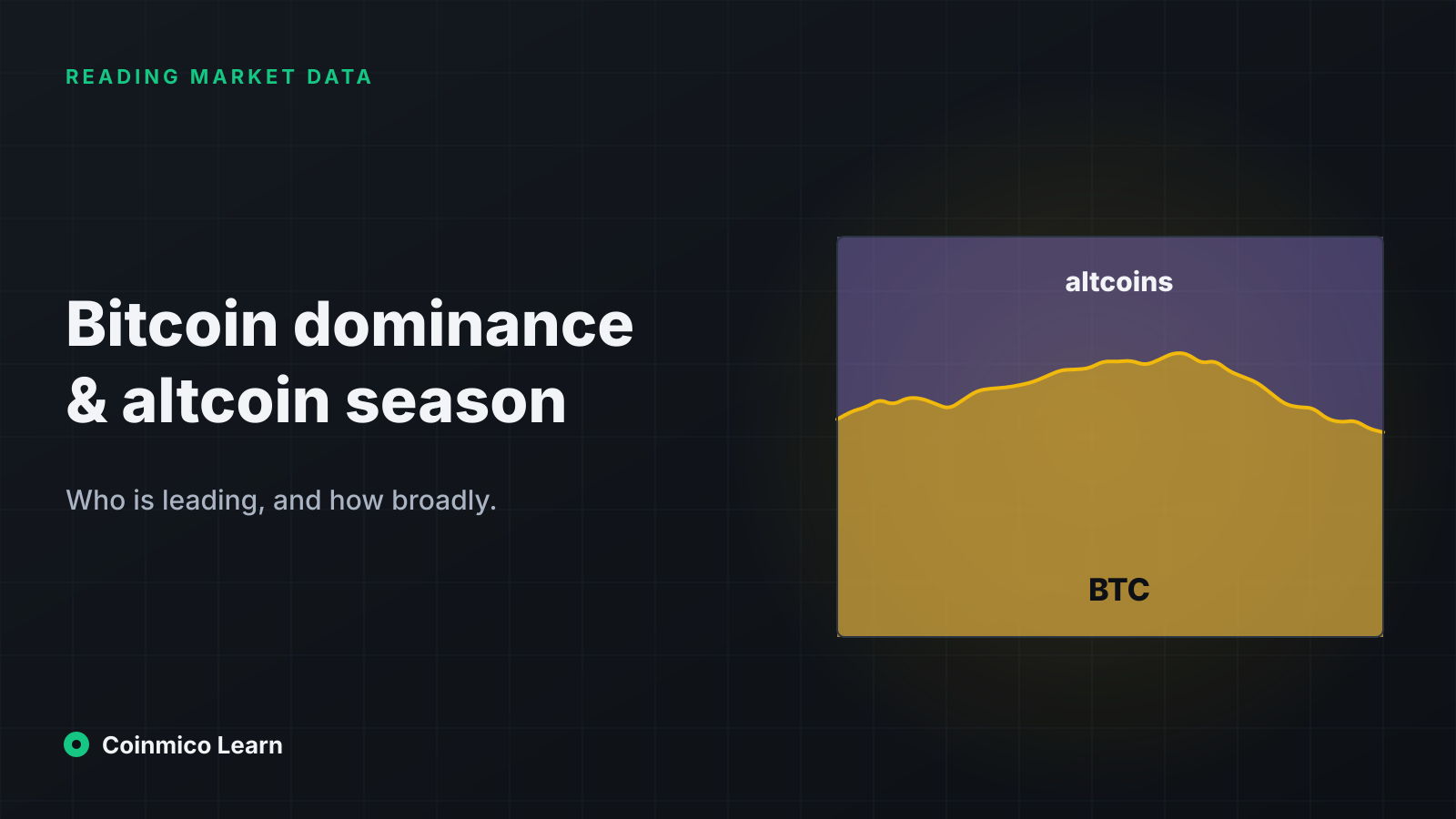
Bitcoin dominance is bitcoin's market cap as a percentage of the total crypto market cap.
If the total market is 3 trillion dollars and bitcoin is 1.7 trillion, dominance is 57%. The figure has ranged from above 90% in the early years, when little else existed, to below 40% at the height of the 2017 and 2021 altcoin booms.
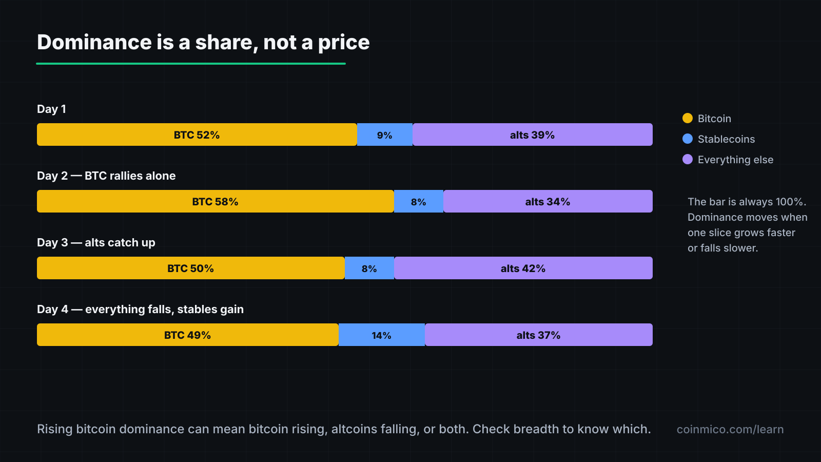
Read the direction rather than the level:
- Rising dominance during a rally: money is entering through bitcoin and staying there. Typical of the early phase of a cycle, and of risk-off periods when traders retreat to the largest, most liquid asset.
- Falling dominance during a rally: bitcoin is rising, but altcoins are rising faster. Capital is rotating outward along the risk curve.
- Rising dominance during a decline: altcoins are falling harder than bitcoin. Usually the late stage of a downturn.
- Falling dominance during a decline: rare, and usually bitcoin-specific news.
Coinmico computes dominance from the same market caps it measures for every coin, with wrapped and bridged copies excluded so that WBTC does not count as both bitcoin and an Ethereum token. The live reading and its history are on the global page.
Stablecoin dominance
The same calculation for USDT, USDC and the other dollar tokens is a useful companion. Rising stablecoin dominance means holders are selling coins for dollars but keeping them in the system — dry powder. Falling stablecoin dominance means that money is being deployed.
Breadth
Breadth ignores size entirely and asks: of the top N coins, how many went up?
If 80 of the top 100 are green today, the move is broad — a market-wide shift in appetite. If 20 are green and the total cap still rose, one or two heavyweights did all the lifting. The second kind of rally is fragile: it depends on a single asset continuing.
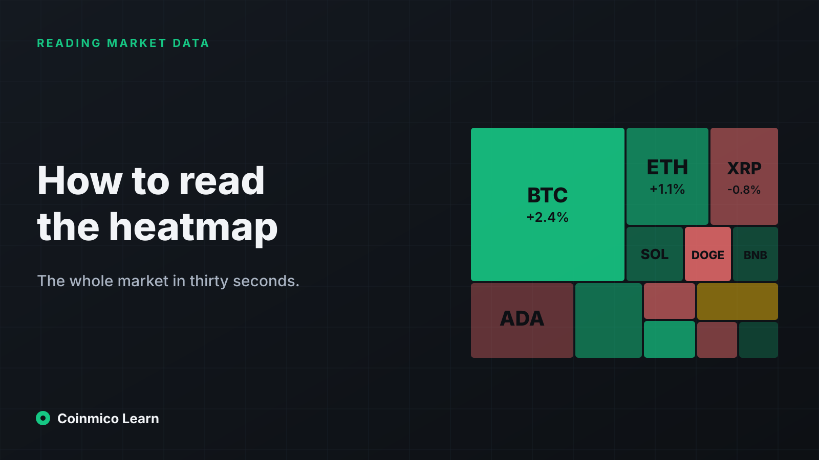
Coinmico shows breadth on the global page as the count of the top 100 rising and falling over 24 hours and 7 days, and the heatmap shows the same information visually — each tile sized by market cap and coloured by change, so a narrow rally appears as one large green tile in a sea of red.
The altcoin-season index
Dominance shows the split at a moment; breadth shows today's direction. The altcoin-season index combines the two ideas over a longer window.
Definition: the percentage of the top 100 coins, excluding stablecoins and wrapped assets, that have outperformed bitcoin over the trailing 90 days.
| Reading | Label | Meaning |
|---|---|---|
| 75 or above | Altcoin season | Three-quarters of large altcoins have beaten bitcoin for a quarter. Broad rotation. |
| 25 or below | Bitcoin season | Bitcoin has beaten three-quarters of them. Capital is concentrated. |
| In between | Neutral | No clear regime. |
The 90-day window is deliberate. Altcoins routinely beat bitcoin for a week and lose it all the next; a quarter filters out that noise and catches only sustained rotations. Coinmico calculates the index from its own 90-day price history for each coin, and shows it in the Market Status block on the [homepage](/) and on the global page.
How to use it
The index is a description of the recent past, not a forecast. Its value is in naming the regime you are in so you can size expectations:
- In bitcoin season, altcoins tend to fall further on bad days and lag on good ones. Being early into an altcoin position is expensive.
- In altcoin season, the reverse — but these phases have historically been short and ended abruptly, with dominance snapping back over weeks.
- A reading crossing from below 25 towards 50 while dominance falls is the classic early-rotation pattern. It is also the point at which the most speculative behaviour begins.
Putting the three together
A quick reading of any day:
- Total market cap direction — is money entering or leaving crypto?
- Bitcoin dominance direction — is it concentrating or spreading?
- Breadth — how many coins agree?
A rising total with rising dominance and narrow breadth is bitcoin alone. A rising total with falling dominance and wide breadth is the whole market moving. A falling total with rising dominance is altcoins being sold hardest. Each combination suggests a different posture, and none of them can be read from a single coin's chart.
The two largest assets over the last quarter, for a direct view of relative performance:
What this means in practice
- Check dominance before reading any altcoin's move; the same 5% gain means something different in each regime.
- A rally with fewer than half the top 100 rising is one asset's rally, whatever the total says.
- The altcoin-season index labels the regime; it does not predict when it changes.
Next in this track
The figures in this lesson are all measured from prices and caps. The next lesson turns to sentiment — the Fear & Greed index — and explains how Coinmico calculates one from market data alone.
Assets in this piece
 Bitcoin
 Ethereum
Every figure here is measured by Coinmico across the venues and chains we index. See our methodology.