How to read a market heatmap in thirty seconds
A heatmap shows the whole market on one screen — size as area, performance as colour. Read properly, it answers three questions a price list cannot: what is moving, whether the move is broad, and where the money is concentrating.
What you will learn
- Tile area is market cap and colour is percentage change, so the heatmap is market cap and performance rendered at once.
- Read the whole picture before any tile: one big green tile in a sea of red is a bitcoin-only day, not a rally.
- Switching the timeframe from 24 hours to 7 or 30 days separates noise from a trend; switching the size metric to volume shows where trading is, not where value is.
A table of five hundred coins tells you about each coin. A heatmap tells you about the market. It is the fastest way to see whether today is a bitcoin day, an altcoin day, or a day everything falls together — and the Coinmico heatmap does it from the same measured index as every other page.
How the picture is built
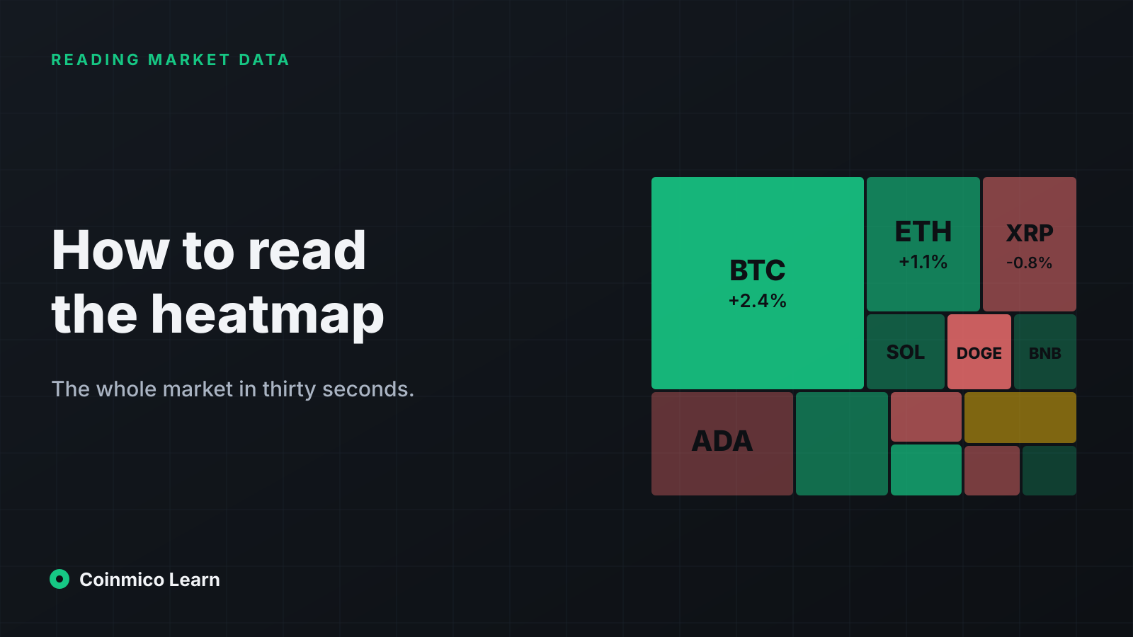
A heatmap is a treemap: a rectangle divided into tiles, each tile a coin.
- Area is proportional to market cap (or, optionally, 24-hour volume). Bitcoin is the largest tile, then ethereum, then the rest in descending order, down to tiles too small to label.
- Colour is percentage change over the selected period. Green for up, red for down, with intensity for magnitude: pale for a fraction of a percent, saturated for double digits. Grey or neutral is unchanged.
- Tiles are usually grouped into sectors — layer-1 chains, DeFi, stablecoins, memecoins — so that a whole category lighting up is visible as a block.
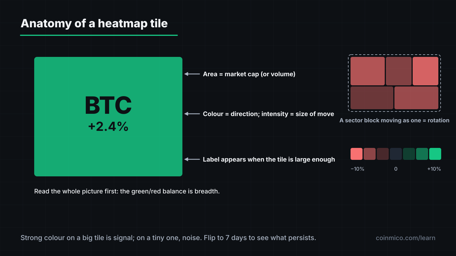
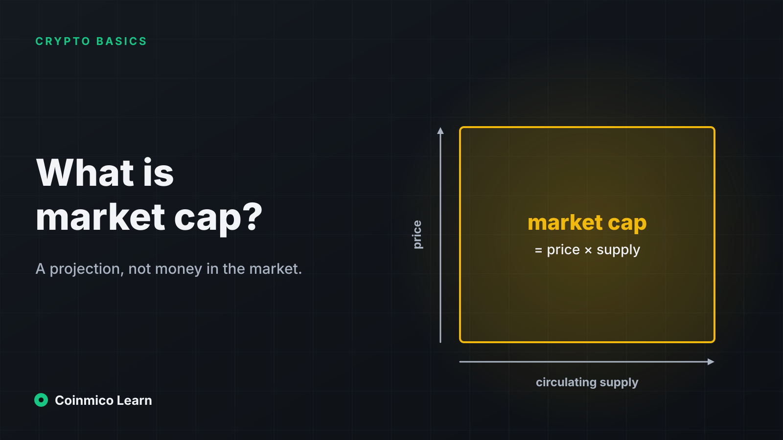
Every tile is therefore two numbers from the market cap and price lessons, drawn instead of listed.
The three reads
1. Colour balance: is the market up or down?
Before looking at any tile, take in the ratio of green to red across the whole image. This is breadth — the same figure the Fear & Greed lesson uses as a component — seen directly.
- Mostly green, bitcoin green: a broad rally.
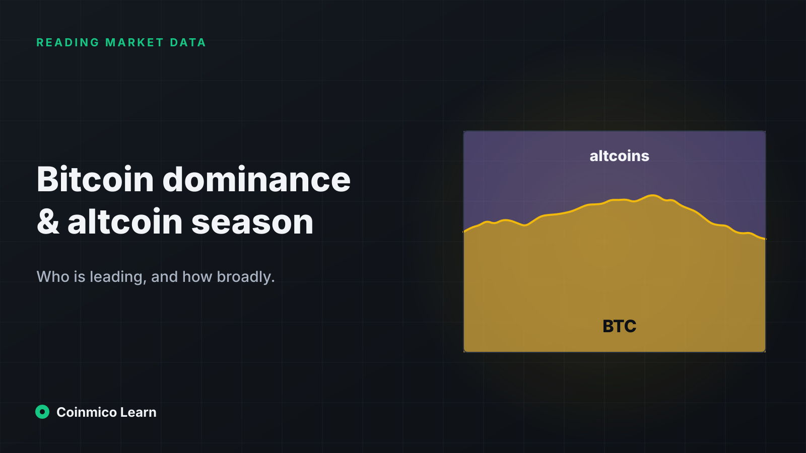
- Bitcoin green, most small tiles red: money is moving into bitcoin and out of everything else. The market cap total may be up while most holders are down. This is a rising-dominance day; the dominance lesson covers what that means.
- Bitcoin flat or red, small tiles bright green: an altcoin day. Often short-lived; check whether it persists on the 7-day view.
- Everything red: a risk-off day. Look at how red the stablecoin block is — it should be neutral; if stablecoin tiles show movement, a peg is under stress.
2. Size versus colour: where is the move?
The most intense colours are almost always on the smallest tiles, because small caps move more. That is expected and mostly noise. What matters is colour on large tiles: a 5% move on a top-ten coin is a significant event; a 40% move on a tile you have to zoom into is a Tuesday.
A useful habit: find the largest tile with a strong colour. That coin is where the day's meaningful flow is.
3. Sector blocks: is there rotation?
When a whole sector block shares a colour that the rest of the map does not — every layer-2 tile green while the rest is grey, or every memecoin tile deep red — that is rotation: capital moving into or out of a theme. Single-coin moves are news; sector moves are positioning, and they tend to persist for days.
Changing what the map shows
The two controls that change the reading most:
Timeframe. The 24-hour view is the default and the noisiest. Switch to 7 days and most of the bright small tiles fade to neutral — the coins that stay bright are in a trend, not a spike. The 30-day view shows the month's winners and losers at a glance and is the best single view for seeing which sectors have been leading.
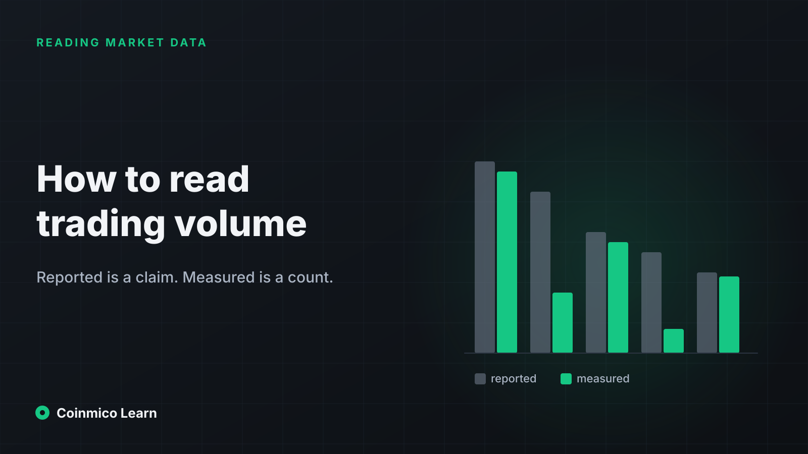
Size metric. Sizing by volume instead of market cap redraws the map by where trading is happening. Coins with high volume relative to their cap balloon; large, sleepy caps shrink. On a volume map, a small coin drawn large is one being traded far more than its size warrants — sometimes genuine interest, sometimes the reported-volume problem from the volume lesson. Coinmico's heatmap uses measured volume, which limits the second case.
What the heatmap does not tell you
- Why. Colour says what moved, not the cause. The news page and a coin's own page answer that.
- Liquidity. A bright tile on a coin whose entire volume is one thin market is a price nobody can trade at size. Check the coin's markets before acting on its colour.
- Anything about the future. A map of the last 24 hours describes the last 24 hours.
A thirty-second routine
- Whole image: green or red? Roughly what share of each?
- Bitcoin's tile versus the rest: same colour or opposite?
- Largest strongly coloured tile: which coin, and is it a top-twenty name?
- Any sector block moving as one?
- Flip to 7 days: does the picture hold?
That is the market's day, read before the coffee cools. The Coinmico heatmap and the global overview, which reports the same breadth and dominance as figures, are built for exactly this.
What this means in practice
- Read the picture before the tiles. Breadth is the message; individual colours are the detail.
- Weight moves by tile size. Strong colour on a big tile is signal; on a tiny one, noise.
- Use 7 and 30 days to see trends and rotation that the 24-hour view hides.
Next in this track
The Fear & Greed lesson turns breadth, momentum and the other things the heatmap shows into one number, and explains exactly how Coinmico computes it.
Assets in this piece
 Bitcoin
 Ethereum
 Solana
Every figure here is measured by Coinmico across the venues and chains we index. See our methodology.